A discussion with Creative Director UPASANA NATTOJI ROY at the animation studio Switch!, located in Mumbai, India.
Tell us a little bit about your background, and your company, Switch!
UNR: Switch is an animation studio that takes on a diverse range of communication projects — from ad films and title design to PSAs, packaging & promos.
I joined the National Institute of Design, India, after high school with an interest in textile, product & communication design. The universal appeal of animation, the variety of styles and ever-widening spectrum of mediums to play with, made it my natural choice of specialization. As a student I took on professional projects with India’s national television and trained with Channel [V] — Asia’s premiere music channel.
After graduation, I started working simultaneously on experimental projects ranging from installations for museums to commercial broadcast films in India. I moved to Dubai as a senior producer and worked in promos and packaging in Ten Sports (a sports television channel) and Dubai One (an English entertainment channel). Throughout my time in Dubai I continued to collaborate on projects based in India. I was constantly taking on projects which were multidisciplinary. The idea of neat little defined boxes of genres bothers me. The fact that one should either be an ad film maker or a feature animator, even having to stick to live action or animation seems restricting to me.
The purpose of any of these mediums is to communicate. The style chosen is just one of the tools available; the medium is not the message. Switch! was born with this perspective. After working in broadcast, specializing in promotions and packaging for over seven years, I decided to take on the challenge of going the distance on my own. I am building Switch! as a platform for collaboration between specialists in various forms of communication design involving the wide spectrum of film, animation and motion graphics.
How often are unique title sequences used in Indian cinema?
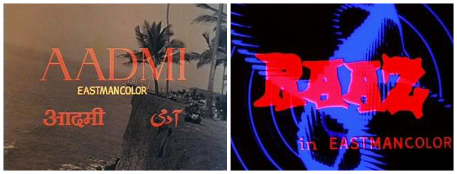
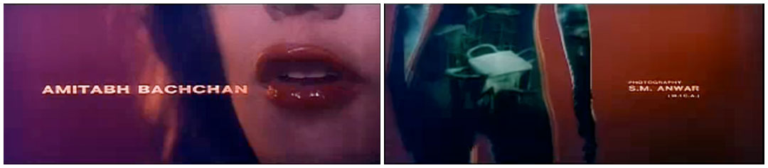
In Indian mainstream cinema, till recently the hierarchy of importance has been — Stars, music, stars, story, dance, stars, locations, stars. So as is obvious giving credit where credit is due has been a formality and an afterthought. Normally the main credits were placed on the opening shots itself.
Traditional main title credits
(ʻRaazʼ means mystery — Titles for a horror, thriller, slasher film.)
The most that it would involve is the default wipe or preset animation available on whatever machine they were doing their postproduction. Design in general is a very nascent discipline in India. It comes as a surprise as we are surrounded by organic design all around us on our streets, be it urban or rural.
It would be unfair to say that Indian cinema has not seen unique title sequences. Filmmakers have experimented over the decades though the language was often borrowed in some cases such as the example below. The inspiration is clear though the adaptation is very Indianised, in this case the figure is clearly that of a curvy Indian woman.
Maurice Binder “James Bond” inspired credits
Earlier, in India, there was a need to have the main titles in three languages. English, Hindi and Urdu. Now that rule has been relaxed and is left to the creative decision of the director and producer.
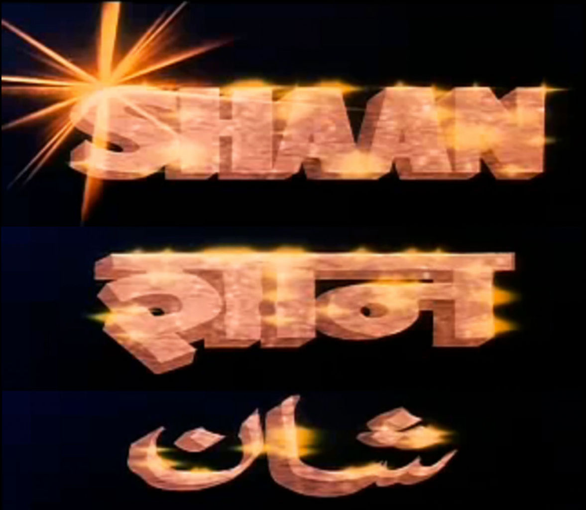
3 language credits
There has also been some experimentation with type, for example this regional film by Satyajit Ray used “alpona” inspired typeface. “Alpona” is a decorative art form from Bengal India. The medium used is a paste of rice painted using a hand brush. The style is often floral.
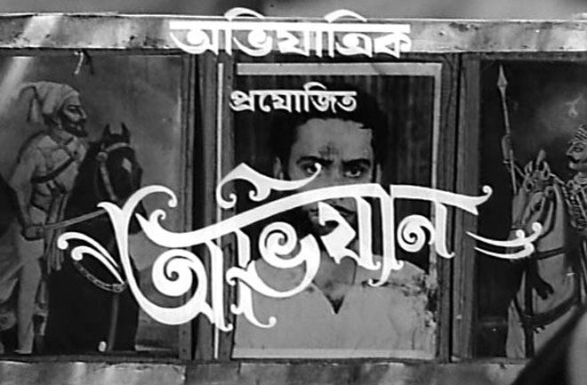
“Abhigyaan” from Satyajit Rays film
In current times, there is a growing interest in title design and the awareness that a film needs to be introduced or even packaged.
How did you become involved with the project? How did the idea of an animated title sequence come about?
I got involved almost at the inception of the film — the screenplay of Aagey Se Right. I worked on the film as the screenplay editor, balancing my then full time job in promos and packaging in a television channel. This involved knowing the film from its soul and the whole process of its birth till it blossomed into a multilayered ruthlessly funny film. After that I moved onto shooting the film as the director’s assistant, making sure nothing is lost in translation between the feature director — Indrajit Nattoji’s twisted brain and the various departments. Throughout this time Indrajit and I often discussed directions and ideas for the title sequence, it was clear before we shot the film that I would be responsible for the title design, though the degree of animation or style within it was left organic.
After doodling and bouncing the various directions with Indrajit — I realized that nothing would do justice to it as a title sequence except a short film, on the film. That’s when we narrowed down on animation as the best medium to work with for this film.
Wall “drawing” inspiration
Take us through the design process, how did you develop the concept for the piece?
The director had given me a free hand, knowing I had a clear grasp on the film and what he set out to do with it. His brief to me was “make every frame a painting” and it should be something we have never seen before (pressure, pressure, pressure). Of course the added constraint from the producer was zero budget and less than a month from concept to final renders.
The title track was decided quite early on. In Bollywood, the music and songs often need to be ready before the film goes into production so that the song and dance can be planned along with the shoots for the film. The music for the film is actually released before the film to garner interest with viewers. This is a part of the standard marketing strategy used for mainstream features.
“Hippie tu Jhoom” composed by Amartya Raut was chosen because the lyrics of the song hold together various events in the film. The song went through various drafts and each version was completely different (I loved them all). The final version is a great driving track with a lot of street cool to it. The spontaneity and humour of the song rings true the spirit of the film.
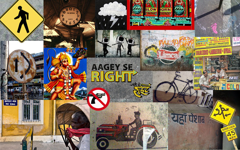
Inspiration sheet
The titles started out as concept discussions while working on the screenplay. We wanted to use it to tie in the opening shots to the rest of the film. So as the screenplay changed so did the plot and style for the titles. Finally we decided that the titles would be a concept bridge as well as a visual transition of the journey of the hero. Aagey Se Right has three heroes, in random sequence of importance — Gun, Cop and Terrorist. The mayhem that ensues within the film due to these three heroes holds the essence of the film. In order to create that in the titles and to keep a degree of mystery, it needed to remain abstract.
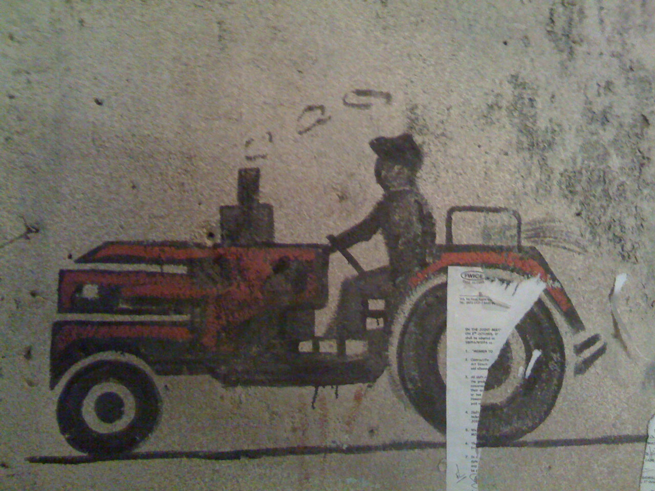
As we got into preproduction of the film, I kept brainstorming on the various ways of achieving the journey. A lot of the ideas incorporating scale had to be swept aside due to the sheer lack of time and funding. The preproduction involved a lot of recci (scouting) for location. This kept me traveling through Mumbai. I would also take off on my own to ‘collect’ inspiration. Thats when I stumbled upon a graphic on an obscure wall in Mumbai which was the key to the style that finally evolved. On an urban, street-level, there is organic design all around. It is a shame why most of the derived inspiration is confined to print or packaging in music channels.
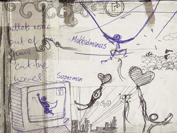
Initial sketches
Both Indrajit and I (and many others who have worked in packaging and promos for music channels) have a fetish for street graphics and signage. For the titles I looked around our colourful city for direction (or the lack of it). It was a conscious effort to make sure the titles didn’t just look like still frames of stuff from the street simply strung together. The Indian Urban street kitsch has been exploited well and done to death by Channel [V] and MTV. It needed to be “inspired by” street graphics but taken to the next level — made into a new visual style that I hadn’t seen before. Once we agreed on animation as the medium and a short film format for titles, I was completely on my own.
The Cop and the Terrorist being of “human” form, I took the pedestrian sign to symbolize and ‘act’ out not only their parts but all human roles. The Gun meanwhile took on the mantle of being the hero and the ‘trigger’ for all actions. The gun — shot, chased, dived, flew, ran across the titles while the pedestrian responded as per the various characters of the film.
With the story line reworked for the titles in place, I proceeded to make a rough storyboard/timeline to help time the duration for titles on screen. Once the almost-final list of titles were given they were added to the rough animatic to pace it out.
Early storyboard animatic
The animatic and storyboard were intentionally not polished to keep the process organic while creating the elements within each frame. For example — the humour from the film could spill aptly and happily into the titles. On the onset of the man’s journey it was clear that he couldn’t be sitting on the second bike constantly (the cop rides a Royal Enfield Bullet motorcycle in the film). That is when Indrajit jumped in again with — “make him ride the ‘bullet’ ” — Enfield Bullet motorcycle vs the gun’s bullet. Ha! It was creatively satisfying that this kind of improvisation with the animation was possible.

Final elements collage
The Aagey Se Right titles are a jigsaw puzzle in motion. For those who haven’t seen the film it works as a precursor to introduce the main three heros and the multiple, bizarrely varied sub plots within the film. For those who choose to watch the film again, they will enjoy the ‘guess who and where’ game.
While taking the viewer through the main events it even touches up upon the teeny, mini-plots (creative freedom) as well — hello cop, hello terrorist, cop loses gun, terrorist loses heart, jump underground factory, big exploding toilet, media chase, man or superman, cow-napping aliens, DJ bomb, mumbai city (please note the hoardings in the distance, even if you need to pause the frame), night chase, Gateway of India (in the film we had a model of it in the climax) and many other endearing characters.
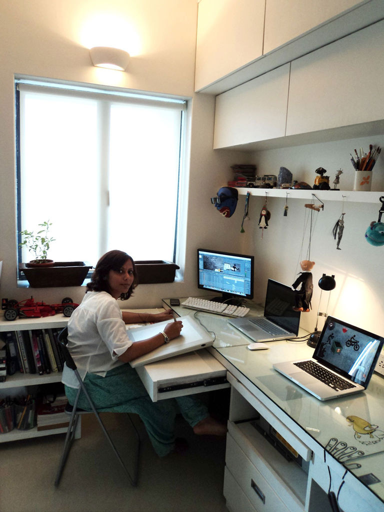
Upasana Nattoji Roy at the Switch! office
How was the sequence put together, and what was the most difficult aspect of this piece?
The title design was animated using custom vector elements in Adobe After Effects. I used a 2.4GHz G5 — which was powered with 8GB RAM (much to my dismay — only 3GB could be allocated to After Effects.) I consciously used the rudimentary aspects of the software, which worked well with the style as it offered the ‘rough’ around the edges — craftsy feel that we wanted. Plugins were consciously avoided without covering up with dust and flares and other such distractions.
Limited resources proved to be the most difficult aspect of the project as well as a blessing. Difficult with regard to computers — at that time I had just one machine which did it all. That machine was too old to be upgraded to take on 2k renders. Blessing because with this constraint I worked out a streamlined system of file management which will make future, more complicated projects easier to handle. Difficult with regard to manpower — one person did it all — Since I had a zero budget I couldn’t even hire an assistant for the cleanups. Blessing because I could work on it the ‘artistic’ way with the freedom for spontaneity.
After Effects is often considered a ‘low end’ software by hardcore post guys, but the versatility of the software is unparalleled. It handles different animation and motion graphics styles with ease even in its most raw form. When used with hand drawn/Illustrator/Photoshop elements — it frees the visualizer from creative constraints. Combined with added on plug-ins — it is quite a force to reckon with. As Ninja Assassin would say — “Fear not the weapon but the hand that wields it.” I believe softwares are just another tool to add to your palette. What you do with it entirely depends on your imagination.
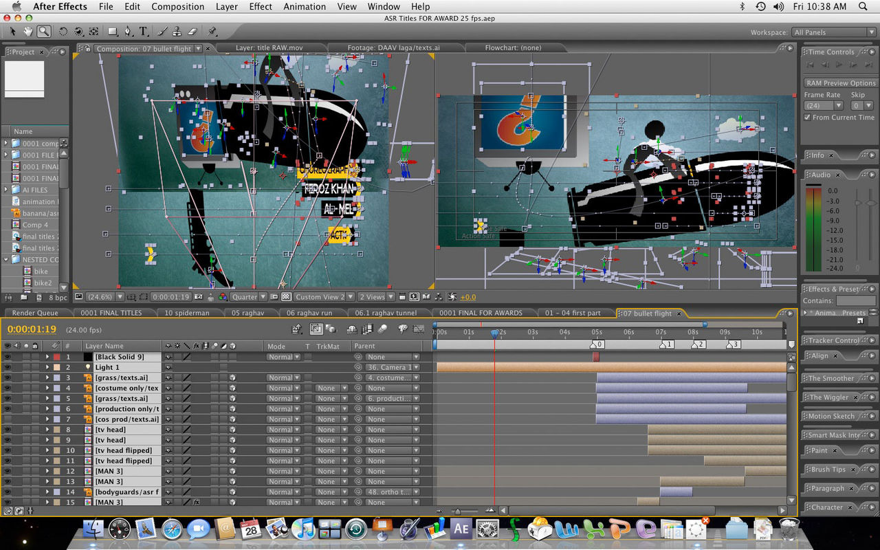
After Effects project for bullet sequence
Who inspires you and what excites you outside of design?
The answer to this could be either very short — ‘everything and everyone’ or a very long description. My choice of profession was primarily based on the multiplicity it offers — from thought to styles, materials to inspirations. One source of inspiration is travel and the people I meet during my travels. It offers me the openness to accept and inculcate multiple points of views.
Another source are the Indian classical arts. I am a professional Indian Classical Dancer. After training and performing Bharatanatyam from the age of five — have added on Kathak in my repertoire. Dance is incomplete without music. So an initiation into Hindustani classical was also natural. This gives me the sense of timing within my work. I often delve into my experiences, emotions and storytelling styles of the performing arts as a bank for my inspirations. A constant desire to connect and link the core principles and ideologies between the various art forms (dance, music or visual arts) and life, is something that deeply influences me as a person and my work.
What are some examples of title design that were influential to you as artists?
Designers — Saul Bass, Kyle Cooper and Michel Gondry. A lot of title design influences are also from music videos: “Take On Me” — Aha, Peter Gabriel’s videos, Chemical Brothers’ videos, Daft Punk’s videos, ”Mad About You” — Hooverphonic, ”All is full of love” — Bjork, ”Strawberry Swing” — Coldplay, ”Her Morning Elegance” — Oren Lavie.
Title Design: Catch Me If You Can, Lemony Snicket’s end credits, Juno, Zombieland, — the way the film is packaged.
What are you working on now?
Currently SWITCH! is taking on projects in packaging (for television channels) and ad films. Looking forward to taking on more title design projects both feature and for series. The focus of Switch! is to reinvent visual and storytelling styles in animation and film. We are doing this by building it as a collaboration of specialists who come together on various projects. Apart from the commercial projects I am also trying to squeeze out time to work on my short film.
I have started a project called Avataar — a series on the Dashavataram based on the reincarnations of Vishnu — the god of preservation in indian mythology. The Dashavataram mythology is based on the evolution of human civilization.


No comments:
Post a Comment
Plz add your comment with your name not as "Anonymous"